Monday, March 31, 2008

Cropping (the Rule of Thirds)

Composition:
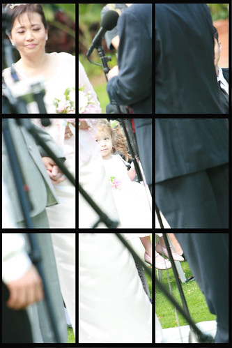
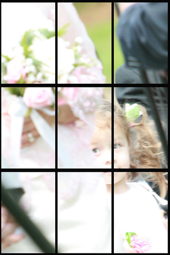
The fundamental rule in composition of photographs is termed "the rule of thirds." If you divide your photo by a grid with two horizontal lines and two vertical lines, your points of interest are best balanced when they are placed along those lines or at the points of intersection. It also forces you to have your photo be mostly content and takes out extraneous empty space. The following is not the best example because I thought I was using the rule when I took the picture in the first place. So, warning, as I crop in, it's going to get grainy.

Here I've used a grid to divide up my photo: It brings two faults to my awareness.
(1) The bride's eyes are closed
(2) Only the pocket of the officiant is anywhere near the "thirds"

Sadly, after all this work, I think if I'd like it better if I had cropped it to look exactly like the center square in the grid. Note how the flower girl's face would be in the top left intersection point of "that" picture.
step 1

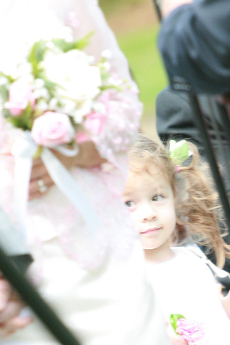
Here's a boring crop. I just centered the little girl:
okay crop
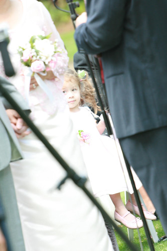
It might look better because now she is clearly the focus of the picture and she takes up more of the photo. But, composition-wise, it lacks interest and seems flat.

There are multiple ways to crop the photo, usually I just use the crop tool and then just ("control" and "z") to undo the action if I don't like. Repeat until I get what I want. The following is a tool of Photoshop that makes it a little easier to double check your composition.

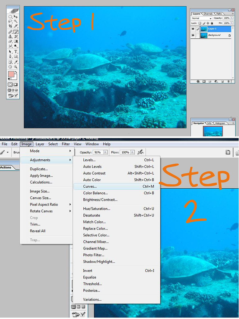
Step 1: Open your picture in Photoshop.
Step 2: To get this wonderful grid, right click on the icon in the tool bar that shows a "rectangle tool" and select "custom shape tool."
-at the top bar, in the "shape" pull-down menu, look for the "grid" icon and click on it
-Drag it over your photo

step 1

Now you're going to manipulate the grid to choose a better composition.

Step 3: Go back to the tools toolbar and look for the arrow icon "path selection tool."
Look at the top of the screen to the menu toolbar and make sure that the "bounding box" square is checked.

Step 4: Left click on your photo. This will bring up the bounding box/grid on your photo. Make sure you hold shift down whil you drag the grid around and drag the corners to change the size.

Step 5: When it is where you want it, double left click on the picture.

step 3

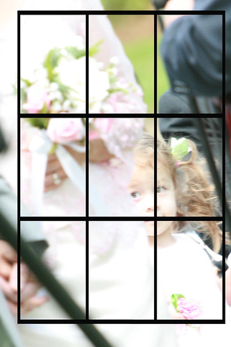
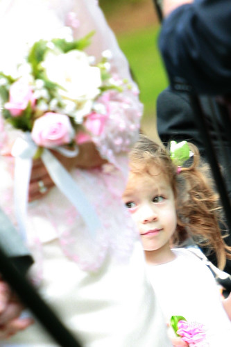
Step 6: There's multiple ways to crop or compose your photo. You can have more artsy or out there images...I could have had both points of interest be the flower girl...but for this one, I chose to make the bridal bouquet one point of interest and the flower girl face the other.

Step 7: Choose your "crop" icon and crop around your grid.

step 4

Step 8: You can now delete the grid layer to get rid of the grid.

(again, please excuse the graininess...not the best example..i'm in to close so it's grainy)

step 5

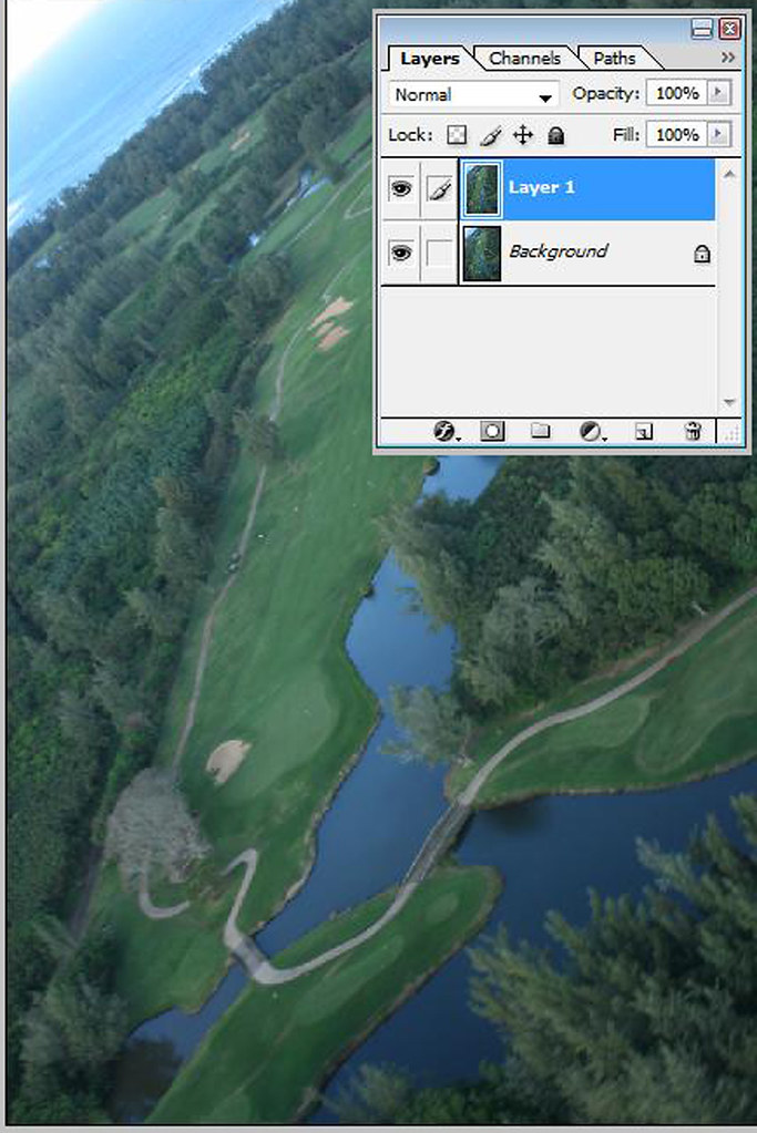
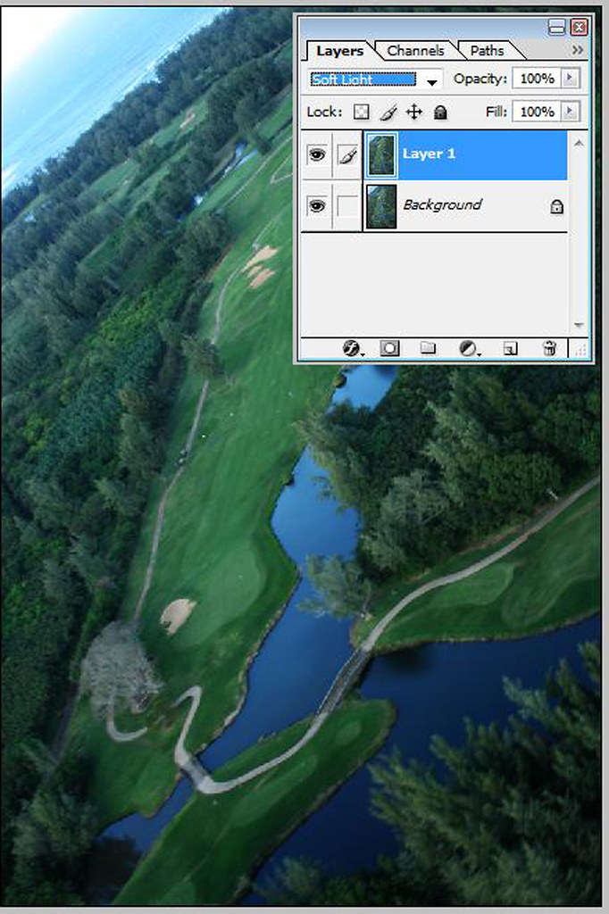
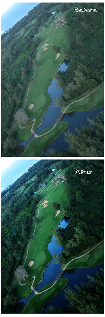
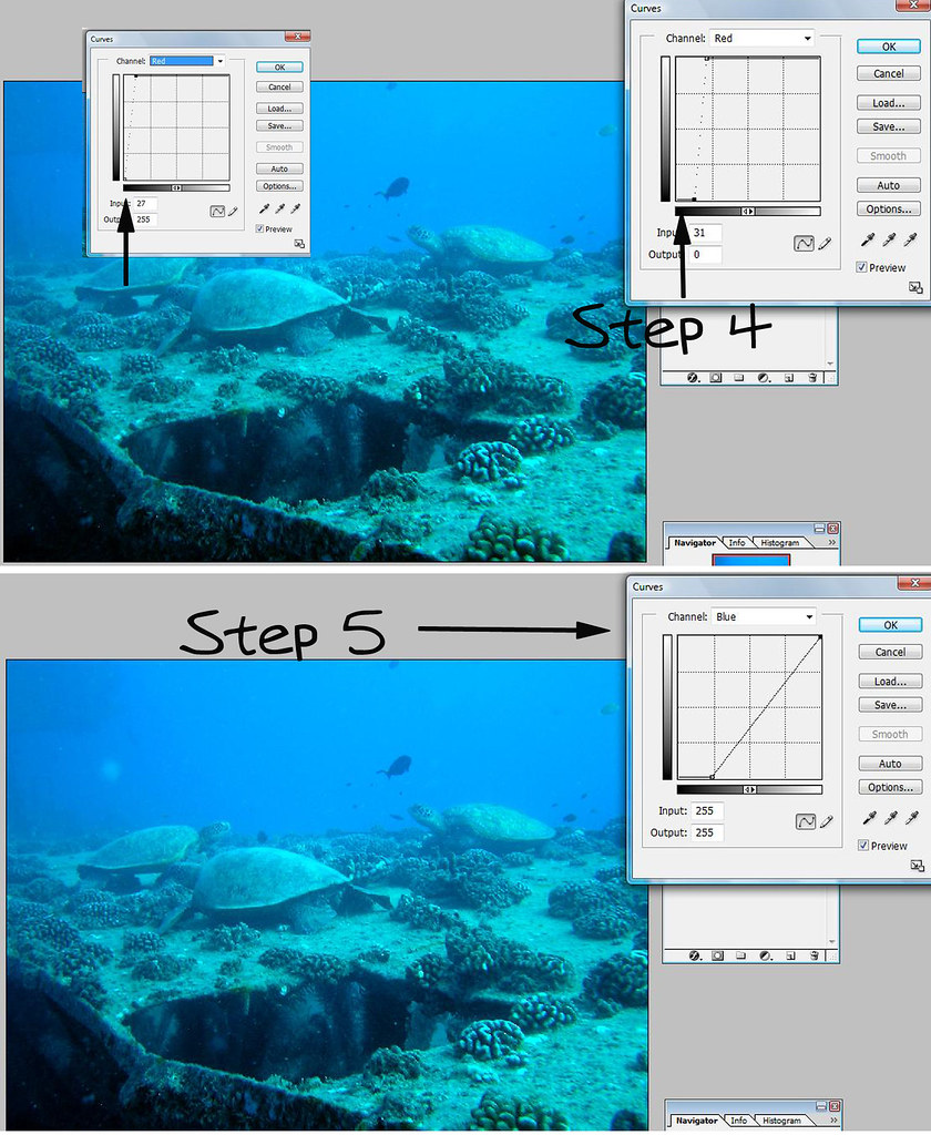
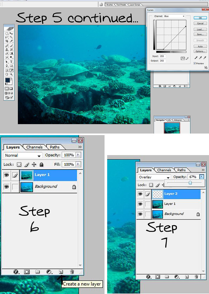
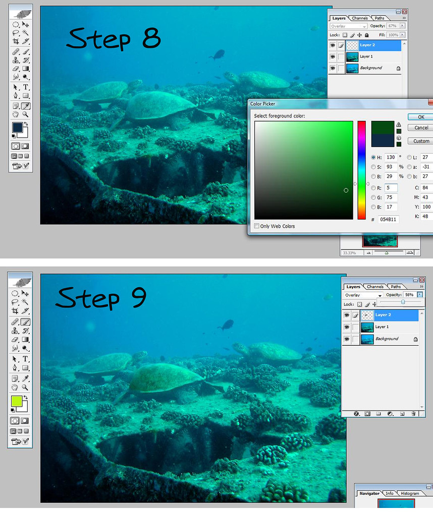
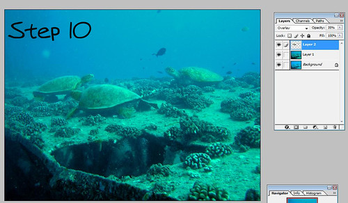
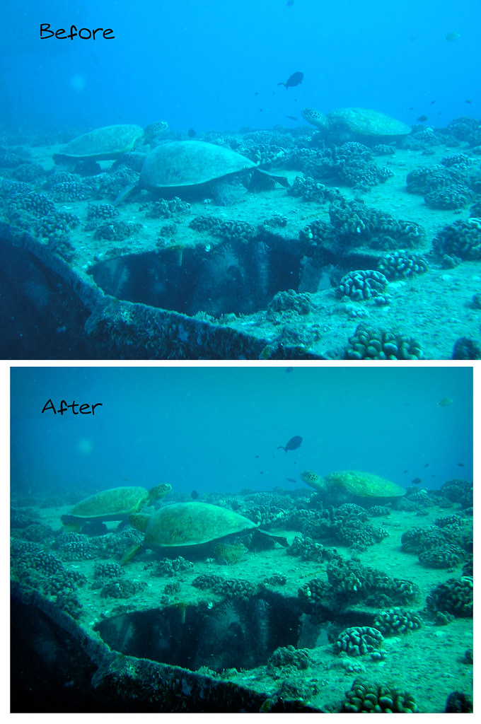
Using other methods: Darkening and deepening colors
Here I create multiple layers and change mode of layers to "multiply" to darken the photo

Step 6

final product

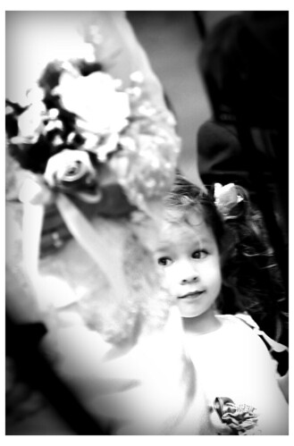
To try and detract from the graininess...I converted to black and white and increased the contrast.

Thursday, March 6, 2008

Vivid Colors with a Soft Light Layer

How do you achieve vivid colors in your photographs?

Using Photoshop's "Soft Light" layers really enhances the contrast in your photos. Your dark areas will appear darker and more intense. Your lighter areas will be lighter and seem to glow.
We will be
1. creating a layer
2. applying "soft light"
3. playing with the opacity

This is a simple trick to play with vivid colors. The intensity of colors decreases with the amount of white light. That's why some photographers prefer to photograph in the early morning or late afternoon. Soft light filters mimic that effect.

Step 1: Open your photo in Adobe Photoshop

Step 2: Create a new layer with a copy of your image
Shortcut: "Control" and "J"
Soft Light Layer Tutorial 1
Step 3: Change your new layer's description from "normal" to "soft light"
You should see an immediate change in your image. To compare the before and after, in your layer's window, click on the "eye" icon to hide and unhide the new layer. Sometimes, it will create parts that are too dark (don't go too overboard). Adjust by changing the opacity of your "soft light" layer or you can use the eraser tool to erase areas(it might appear too drastic) or you can create a mask and use black to paint out areas(little more advanced).

Soft Light Tutorial 2
Play-with-it Options: Repeat the steps to see what happens. Create a third layer and "soft light it." I did it with this photo and then lowered the opacity of the top layer just a notch.

Soft Light Tutorial 2

Before and After: Notice the change in colors...they go from "eh" to "vavoom."
Soft Light Before and After

Sunday, March 2, 2008

Fixing Underwater Pictures In Photoshop with "Curves"

How do you fix the color in underwater pictures?

There are various ways to fix underwater pictures in photoshop. Picassa does a pretty great job with the "lucky button." The first thing you have to understand is that as you dive down deeper, the first color to go is "red." This will give all your photos a bluish/greenish cast. One quick tip is to add a layer, fill it with red, and then change it to overlay.

Another method is a simple method of using the "Curves" function. Here, I will walk you through it step by step. And I mean Step by step.

Step 1. Open your picture in Photoshop. (Hey, I told you I was going to walk you step by step)
Copy the layer that has your picture by pressing "control" and "j." I always like to work off a copy layer so if I screw up, then I can just delete that layer and start over. You can also see if your improvements are pleasing by clicking the "eye" icon to the left of the layer and you should only see your original background layer.

Here we have a cute little picture of turtles having a morning snack on the sandy reef. Not a lot of things of color so we can't drastically change it, but we can add slight improvements.

Underwater Tutorial 1

Step 2: Go to "Image" in the main toolbar---> "Adjustments" ---> "Curves

A popup window should now appear. Good, we're going to play with the levels of red, green, and blue in our picture. Those are our primary colors. Remember, the main problem is we don't have enough red.

Step 3: Select "auto" in the Curves Pop Up Window. Don't press okay or close the window yet.

-Hopefully, you should see some change in your image. In our case, it dropped the blues and greens down and raised the red as much as it could.

In some areas, like the darkest areas of my reef in this photo, the red will go overboard and develop red spots. Let's fix that.

Step 4: Still in the Curves Pop Up Window, go to the "Channels" window and select "Reds" in the drop-down menu.

In the figure below, we are looking at a graph of the reds in our picture. The bottom left corner are the darker spots of our image and the top right corner are the lighter parts of our image. The graph indicates how much red is in each part of that image between those two bookends. I have too much red in my dark shadows so I'm going to adjust the graph in the bottom left corner.

Click on the bottom left corner and drag it to the right. What I'm directing Photoshop to do is to reduce the red in the darkest parts of my picture. Thus the graph in that corner is now a flatline indicating "No red." This step can be skipped if there is no overpowering areas of red.
Underwater Tutorial 3
Let's tweak the overpowering blues and greens so more.

Step 5: Select "Blues" from the dropdown menu in "Channels"

Hint: You can click on any part of your picture, and that area will light up on your graph as a single point. You can then pull that point up or down to influence the amount of blue. Warning, it will shift your graph and your color perspective as well.


Step 5 continued=I'm just pulling the blues down...I'm dropping the top right corner of the graph by dragging it down to reduce the blues in the lighter portion(the water) in my photo. I'm just eyeballing it, so drag it up and down until you get the image you want. You can do it with the green too.. When you're done. Press okay and the "Curves" window will close.
Underwater Tutorial 4
You're done...but you can continue with one of my favorite touches. Painting in Overlay Mode.

Step 6: Go to your layers window and "create new layer." A blank layer should pop up.

Step 7: In the layers window, change the "Normal" to "Overlay" in the drop-down menu

Step 8: We're going to choose a paint color to paint with. So, click on the box with your foreground color.

You can get many different looks with this action depending on what color you pick. I want the turtles to stand out just a little more. So, I'm going to pick green. Now painting green on this layer will cast a green hue to only things that already have a little green to them. If I paint green over a white area, nothing is going to happen. I just want to bring out whatever green there may be in the turtle shell. I could try yellow, realizing that there are probably some yellow tones in there too.

The second thing to consider in color choice is the darkness or lightness of colors. Really light colors are going to lighten the image you're painting over. Dark colors are going to darken the image you are painting over. Thus, this also one of my favorite cheat methods to lighten and darken (burn and dodge) certain pictures. Create an overlay layer and then paint with black to darken, or white to lighten.


Underwater Tutorial 5
Step 9: Decrease the opacity of this layer to around 65-80%.
If you leave it at its original 100%, you're going to look like you're spraypainting neon green over your turtles and it will turn into kid art. You can increase or decrease the opacity later to taste.
Use the paintbrush tool to start painting with the green you selected over the turtleshell.

Underwater tutorial 6

Step 10: I painted over all three of the turtles. Then I adjusted the opacity of the layer to mimic a REALISTIC image. I have a tendency to put too much color and it doesn't look real. You just want to enhance, not forge your way into cartoon world.

I finished it off with a soft vignette look to darken around the edges(another tutorial...another time).

Taaa Daa...it's not phenomenal...but it is an improvement.

Underwater Tutorial Before and After
Darn it...it's a matter of opinions. I just like the second one a tiny bit better. But three turtles...come on...they're always going to be cute.

About Me

I'm a country girl from a little place called Honoka`a. Raise your hand if you can find Honokaa on a map. Hmmm, not a lot of hands raised. I love love my hometown. Now, I live in Kaneohe with my wonderful husband. Our home is usually filled with people, and always filled with God. I'm a nerd through and through. When I was in grade school, my goal was to read every book in the library. I think I got to the D's before I started skipping around. I'm a pastor's wife...I used to be a teacher, but now I have one of the most opposite jobs (hint: think CSI). My husband gave me my first digital camera and I love taking pictures of weddings and keiki.